

Custom Sportswear Color Matching: A Guide for Teams and Brands
Learn how to get accurate sportswear colors. Explore Pantone codes, lab dips, lighting checks, and tips to keep team colors consistent across orders.

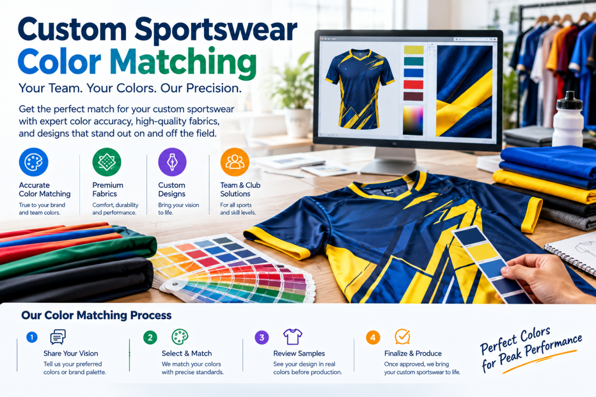
Colors carry your identity before anyone reads a logo. A team in deep navy looks different from one in slightly purple navy. Fans notice. Sponsors notice too. Yet color mismatches happen constantly in sportswear orders. A jersey looks perfect on screen, then arrives a shade too bright. Shorts match the shirt in the factory but clash under stadium lights. These errors frustrate teams and waste money. The good news is that color matching follows clear rules. Once you understand them, you can control the outcome. This guide explains how color works in fabric and print. You will learn about color codes, lab dips, and approval steps. You will also find practical checks to run before bulk production. Let's begin with why colors shift in the first place.
Colors shift because screens and fabrics behave differently. A monitor emits light, while fabric reflects it. That single difference explains many surprises. Fabric type matters too. Polyester holds bright dye differently than cotton. Weave and finish also change how light bounces back. Dye batches add another variable. Two batches of the same fabric can differ slightly. Lighting completes the puzzle. Daylight, LED, and indoor bulbs each reveal different tones. A color that looks rich indoors may look flat outside. Because of this, never approve colors from a screen alone. Ask for physical swatches instead. View them in natural light and under artificial light. Take photos of both, but trust your eyes more. Sharing this knowledge with your team prevents blame later. Small checks now avoid large disappointments after production.
Color control becomes even more important at scale. Brands exploring wholesale custom Tracksuit production must match jackets and pants across thousands of pieces. Jackets and pants often use different fabrics, such as fleece and woven polyester. Those fabrics absorb dye differently, so the same code can look different. Ask your factory how it handles multi-fabric matching. Experienced suppliers dye each component separately, then compare them side by side. They also check every batch against an approved standard. Request that comparison before production starts. Consistency across a full run matters as much as accuracy on one piece. Split shipments can reveal mismatches when orders arrive months apart. Ask about dye lot tracking to prevent this. Written standards help too. Keep a signed swatch on file with your supplier. That single card settles disputes quickly and fairly.
Understanding Color Codes and Standards
Color codes give everyone a shared language. Pantone codes are the most common standard in apparel. Each code refers to a specific printed color chip. That chip acts as a physical reference. Hex and RGB codes describe screen colors instead. They help designers, but factories cannot dye fabric from them directly. CMYK codes suit paper printing, not textile dyeing. So always convert your brand colors into Pantone equivalents. Many suppliers use the TCX or TPX systems for textiles. Ask which one they prefer. Give each color a clear name, code, and location on the garment. Put these details in one specification sheet. Include fabric type, because the same code may need adjusting per material. Send the sheet with your first inquiry. Clear documentation reduces guesswork and speeds up sampling.
Updating Brand Guidelines for Textiles
Brand guidelines often list colors for logos and websites only. Textiles need extra notes. Add acceptable tolerance levels for each color. Tolerance describes how much variation you accept. Many factories measure this with delta E values. Lower numbers mean closer matches. Ask your supplier what range they can hold. Be realistic, because perfect matches between different fabrics rarely exist. Aim for visually consistent results under normal lighting. Update your guidelines after each successful order. Record the approved lab dip numbers, fabric names, and dye lots. Future orders then start from proven data. Teams that document this information save weeks of back-and-forth. New staff members also learn faster. Documentation turns one good order into a repeatable system that protects your brand.
Using Lab Dips and Swatches
A lab dip is a small dyed fabric sample. Factories create it to match your requested color. It shows how the dye behaves on your actual fabric. This step offers the best protection against color surprises. Request lab dips before approving bulk fabric. Most factories provide several options per color, often labeled A, B, and C. Compare them against your reference chip. Check them under daylight first. Then view them under indoor lighting. Choose the closest option and confirm it in writing. Expect lab dips to take about one week. Some colors need several rounds, especially deep reds and bright neons. Build this time into your schedule. Skipping this step saves days but risks entire orders. Few buyers regret spending extra time here. Many regret skipping it.
Checking Colors Under Different Lighting
Lighting changes everything about color perception. Test your approved lab dip in three settings. Use bright daylight near a window. Use warm indoor light. Use cool white light, like office LEDs. Note any differences and share photos with your factory. This effect is called metamerism. Two colors match in one light but differ in another. Teams that play both indoors and outdoors should worry about this most. Ask your supplier whether they use a light booth for checks. A standard booth offers controlled lighting, such as D65 daylight. Request that reading in the approval report. Also check colors on the actual field, court, or arena. Real conditions reveal problems that labs cannot. A quick test on a pilot piece prevents costly reorders.
Matching Colors Across Fabrics and Decoration
Teams rarely use one fabric alone. Shirts, shorts, socks, and bags may all differ. Each material takes color differently, so matching them requires planning. Choose fabrics with similar fiber content where possible. Polyester components tend to match each other more closely. Cotton blends usually look softer and less saturated. Trims add another challenge. Zippers, drawcords, and elastic bands need dye matching too. Order trims early, because sourcing custom colors takes time. Ask for a combined approval board showing every component together. Decoration must match as well. Screen print inks, embroidery threads, and sublimation dyes each reproduce color differently. Approve thread and ink colors on real fabric. Photograph the full set together. This board becomes your master reference for production and quality checks.
Managing Color Consistency Across Reorders
Reorders often reveal color drift. New dye lots may differ slightly from earlier ones. Prevent this by keeping records. Save the approved swatch, lab dip number, and dye recipe reference. Ask your factory to store retained samples from each batch. When you reorder, request a comparison against that retained sample. Order all pieces for one season at the same time where possible. Larger single batches reduce variation. If you must split orders, ask for the same dye lot. Discuss extra quantity for future replacements as well. Teams often need late additions for new players. Ordering an extra ten percent helps avoid mismatches. Communicate reorder needs early, since fabric batches may sell out. Small planning steps protect your team's visual unity all season.
Final Thoughts
Accurate color starts with clear standards. Use Pantone references, physical swatches, and written tolerances. Approve lab dips under different lighting conditions. Match fabrics, trims, and decorations together on one board. Keep detailed records for every reorder. These habits protect your brand's look across every season.







Comments (0)