What Colors Work Best in Restaurant Logo Design?
Starting a restaurant is already chaos. Menus, suppliers, staff, rent… and then someone says, “what about your logo?” Yeah. That part matters more than people think. Not just the shape or font—but the color. Color is what people notice first. Before they read your name. Before they understand your vibe. It hits fast.
 metaminds
Starting a restaurant is already chaos. Menus, suppliers, staff, rent… and then someone says, “what about your logo?” Yeah. That part matters more than people think. Not just the shape or font but the color. Color is what people notice first. Before they read your name. Before they understand your vibe. It hits fast.
When it comes to logo design for restaurants, color isn’t decoration. It’s strategy. It tells people what kind of food you serve, how expensive you are, even how the place might feel inside. Sounds dramatic, but it’s true. People judge fast. Colors help them decide if they’re hungry… or not.
Why Color Choice Actually Matters (More Than You Think)
You ever notice how most fast food places use red and yellow? That’s not random. Red triggers appetite. Yellow grabs attention. It’s almost annoying how well it works.
Now flip that. Imagine a fine dining place using neon green and bright pink. Feels off, right? That’s because color sets expectations. If your colors don’t match your food or pricing level, people feel confused. And confused people don’t buy.
Small businesses mess this up a lot. They pick colors they personally like. Not what works. Big difference.
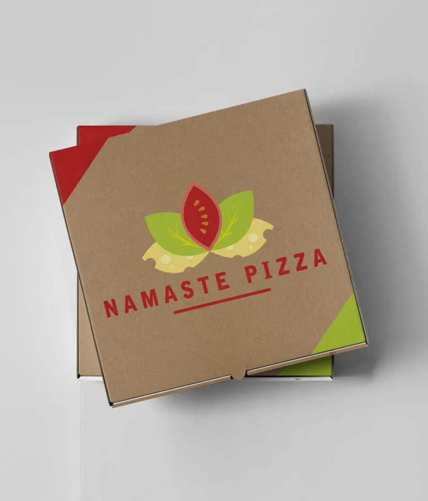
Red: The Appetite Trigger
Let’s start with the obvious one. Red.
Red is everywhere in food branding. And yeah, there’s a reason. It literally makes people feel hungrier. It creates urgency. Energy. Movement.
Great for:
-
Fast food
-
Casual dining
-
Street food brands
But here’s the thing… too much red can feel aggressive. Cheap, even. If you’re running a premium steakhouse, going full bright red might hurt you more than help.
Use it smart. Maybe as an accent. Not the whole story.
Yellow & Orange: Fast, Friendly, and Loud
Yellow is loud. Not in a bad way. It just grabs attention fast. Pair it with orange and suddenly your brand feels warm, friendly, approachable.
This combo works really well for:
-
Cafes
-
Breakfast spots
-
Family restaurants
But… again, context matters. You don’t want a luxury sushi bar looking like a kids’ snack brand. Tone it down if you’re aiming higher-end.
Black: Premium, Clean, Serious
Black is interesting. It doesn’t scream food. But it screams quality.
A lot of upscale restaurants go with black, or dark tones in general. It feels expensive. Controlled. Confident.
If you’re building a brand that wants to say “we’re not cheap, and we don’t need to shout,” black works.
But be careful. Too much black without contrast? It can feel cold. Distant. Add gold, white, or subtle textures to balance it out.
Green: Fresh, Healthy, Organic
Green is basically shorthand for “this won’t make you feel guilty.”
Salad bars. Vegan brands. Organic cafes. Juice shops. They all lean into green hard.
It tells people:
-
Fresh ingredients
-
Healthy choices
-
Natural vibe
But don’t overdo it. If everything is green, it gets boring fast. Mix tones. Add neutrals. Give it some life.
White & Minimal Colors: Clean but Risky
Minimal logos look nice. Clean. Modern. Instagram-friendly.
But here’s the catch… in restaurant branding, too minimal can feel empty. Or forgettable.
White works best when paired with something strong. A bold font. A unique icon. Or even a secondary color that gives it personality.
Otherwise, it just fades into the background.
Matching Colors With Your Food Type (This Is Where Most Mess Up)
Here’s where things get real practical.
Your color choice should match your cuisine. Not your mood. Not your favorite color.
A few quick examples:
-
Italian restaurant → reds, greens, warm earthy tones
-
Japanese sushi → black, white, deep reds
-
Vegan cafe → greens, soft neutrals
-
BBQ joint → dark browns, reds, maybe burnt orange
It doesn’t have to be strict. But it should make sense. When someone sees your logo, they should feel the food before they even read the name.
Don’t Copy Big Brands Blindly
A lot of startups just copy what big chains are doing. That’s a mistake.
Big brands already have recognition. You don’t.
If you copy them too closely, you look generic. Worse, forgettable. People might even confuse you with something else.
Instead, take inspiration. Then twist it. Make it yours. That’s where working with a team like The Logo Boutique can actually help they don’t just throw colors at you, they align it with your brand positioning.
Where a Design Boutique Logo Approach Comes In
This is the part most people skip.
A random freelancer might give you something “nice.” But a design boutique logo approach goes deeper. It looks at your audience, your pricing, your competitors, your long-term brand.
That’s how you avoid basic mistakes like:
-
Using trendy colors that won’t age well
-
Picking colors that clash with your interior or packaging
-
Creating something that looks good… but doesn’t convert
Good design isn’t just about looking pretty. It’s about making people walk in, or click order.
Color Combinations That Actually Work
Not gonna overcomplicate this. Some combos just work. Again and again.
-
Red + Yellow → fast, energetic, hunger-driven
-
Black + Gold → premium, upscale
-
Green + White → clean, fresh
-
Brown + Orange → warm, hearty, comfort food
But don’t just copy-paste. Adjust shades. Add personality. Small tweaks make a big difference.
Test Before You Commit (Seriously)
Here’s something people don’t do enough.
Test your logo colors. Show them to real people. Not just friends who’ll say “yeah looks good.”
Ask:
-
What kind of food does this feel like?
-
Does it look cheap or premium?
-
Would you trust this brand?
You’ll get honest reactions. Sometimes brutal ones. But that’s good. Better now than after you’ve printed menus and signage.
Final Thoughts: Keep It Simple, But Not Lazy
At the end of the day, color in restaurant logos isn’t magic. But it’s powerful. It shapes first impressions fast. And first impressions… yeah, they stick.
Don’t overthink it, but don’t wing it either.
If you’re serious about building a brand, not just a place that serves food, then take color seriously. Think about your audience. Your pricing. Your vibe. Then build from there.
And if you’re going the smarter route, working with a proper team that understands design boutique logo strategy like The Logo Boutique you’ll save yourself a lot of trial and error.
Because honestly? Fixing a bad logo later is way more painful than doing it right the first time.