
Getting the Design Right on Hanging Tab Boxes
Good hanging tab boxes need more than a sturdy tab. Here's how smart design choices around placement, finishes, and layout affect shelf appeal.
 alypackagingau
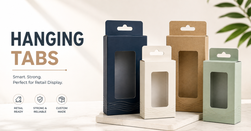
A friend who does freelance packaging design showed me two versions of the same hanging tab box a while back. Same product inside, same brand, same colors even. One looked sharp on the hook, logo clear, everything balanced. The other looked like someone had squeezed the design in around the tab as an afterthought, slightly off center, a bit cramped near the top. Same printer, same materials, same cost almost exactly. The only real difference was that someone thought through the tab placement before finalizing the artwork instead of after.
That's the part that trips up a lot of brands with hanging tab boxes specifically. The structural side, the die cut tab, the reinforcement, tends to get planned properly. But the actual design around it often gets treated like a separate problem to solve later, and that's usually where things start looking a bit off.
Why the Tab Changes How You Design the Rest of the Box
Every other packaging format gives a designer a fairly clean, uninterrupted surface to work with. A hanging tab box doesn't. There's a cutout sitting right at the top, sometimes reinforced with extra board, and it has to be factored into the layout from the very beginning rather than treated as a hole to work around later.
Ignore this early on and the usual result is a logo pushed slightly off center, or product information crammed into a smaller space than originally planned because the tab ate into room that wasn't accounted for. It's a small shift, a few millimeters sometimes, but it's the kind of thing that makes a box look either intentional or slightly rushed, and customers notice that difference even if they couldn't explain exactly why.
Practical Design Choices That Actually Help
Keeping the brand's main logo or focal point in the center third of the front panel tends to work best, since that's the zone least likely to be affected no matter where the tab ends up sitting relative to the rest of the layout.
Using color contrast around the tab area helps too. A slightly different shade or a simple border near the die cut draws the eye naturally without looking like an accident, turning what could be an awkward gap into something that reads as an intentional design choice.
Leaving a bit of breathing room near the top edge, rather than pushing content right up against where the tab sits, avoids that cramped look that shows up when everything gets squeezed to fit around a late addition to the design.
This hanging tab boxes page shows a range of layout examples across different board weights and tab positions, useful as a reference before locking in artwork for a new product line.
Finishes Worth Considering
Matte lamination tends to give a cleaner, more premium look for hanging tab boxes specifically, since these boxes usually get handled a fair amount on a hook wall, picked up and put back repeatedly, and matte tends to hide fingerprints and light scuffing better than gloss does over time.
Spot UV on just the logo or key branding element can make a design pop without needing a full glossy finish across the whole box, which keeps cost more reasonable while still adding a bit of visual interest where it actually matters most.
Foil accents work well for brands going for a more premium shelf presence, though it's worth checking that foil placement doesn't interfere with the reinforced tab area, since that combination can sometimes cause issues during the die cutting process if not planned carefully.
Common Design Mistakes With This Format
Finalizing the full artwork before confirming exact tab placement is probably the most common one. It leads to last minute compression or shifting that rarely looks as clean as a layout planned around the tab from the start.
Using very thin or delicate fonts near the top of the box is another. Anything close to the tab area gets more wear from handling over time, and delicate typography doesn't hold up as well visually once a box has been picked up off a hook a few dozen times.
Overcrowding the front panel to compensate for the space the tab takes up tends to backfire too. A cleaner, simpler layout usually reads better on a hook wall from a short distance than a busy one crammed with extra text or graphics trying to make up for lost space.
Where This Actually Gets Used
Hardware and tool accessories lean heavily on hanging tab format, given how much of that category gets displayed on peg walls in stores. Cosmetics and small beauty items use lighter versions of the same format, usually with more premium finishes given the price point of what's inside. Pet accessories and small electronics show up constantly too, categories where shelf space is limited and hook displays let a retailer stock far more variety in the same footprint.
These fall under the broader display boxes category alongside other retail focused formats built around visibility rather than just protecting a product during shipping.
Brands stocking multiple retail locations sometimes need a mix of formats depending on where a product actually sits in a store. It's worth looking at counter top boxes as a companion option too, since the two often get ordered together for brands with products split between hook displays and checkout counters.
Why This Level of Detail Actually Matters
None of this changes the core function of a hanging tab box. It still needs to hold up on a hook and survive repeated handling regardless of how the design looks. But the visual side is what actually gets noticed first, in the split second someone's scanning a wall of similar products deciding what to grab.
A design that accounts for the tab from the start looks intentional and put together. One that treats it as an afterthought usually looks like exactly that, even when the underlying structure and material quality are identical. For a brand trying to stand out on a crowded hook wall, that difference in how the design was actually planned tends to matter more than people expect walking in.
Final Thoughts
Getting a hanging tab box right isn't just about picking sturdy board and reinforcing the die cut properly, though both of those matter plenty. It's also about designing around the tab from the very first draft rather than squeezing everything else in after the structural decisions are already locked in. That order of operations, structure and design considered together rather than one after the other, tends to be the difference between packaging that looks deliberate and packaging that just looks finished in a hurry.