Stop the Scroll: How Commercial Storefront Signs Drive Foot Traffic in Minnetonka
In an era where our eyes are perpetually glued to smartphone screens, the physical world has to work harder than ever to get noticed. We talk constantly about "stopping the scroll" on Instagram or TikTok, but for business owners in Minnetonka, the real challenge is stopping the "physical scroll"—the rhythmic, autopilot movement of commuters driving down Highway 7 or pedestrians strolling through the Ridgedale area.
Your storefront is your most expensive billboard. If it isn't converting passersby into entrants, it’s underperforming. In 2026, commercial storefront signs in Minnetonka have evolved from mere identifiers into high-conversion marketing tools. Here is how high-impact signage breaks the digital trance and drives real-world foot traffic.
The Psychology of the "Physical Scroll"
Why do we walk or drive past businesses without seeing them? It’s called sensory adaptation. Our brains are wired to filter out repetitive or "quiet" information to avoid overstimulation. A faded, flat, or poorly lit sign becomes "background noise."
To "stop the scroll" in the real world, your signage needs to trigger a pattern interrupt. In a sophisticated market like the West Metro, this doesn't mean being the loudest or the brightest—it means being the most intentional.
The 3-Second Rule
In Minnetonka’s high-traffic zones, you have approximately three seconds to communicate three things:
-
Who you are (Brand Identity)
-
What you do (Category Clarity)
-
Why you matter (Quality Signal)
If your sign is cluttered with too much text or uses a font that’s hard to read at 40 mph, the brain ignores it. Elite signage uses high-contrast colors and "negative space" to ensure those three seconds are maximized.
4 Signage Strategies to Drive Foot Traffic in 2026
1. The "Blade Sign" Hook
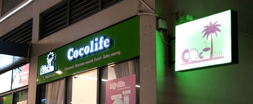
While your primary building sign handles long-range visibility, blade signs (mounted perpendicularly to the building) are the kings of foot traffic. For businesses in walkable pockets of Minnetonka, a blade sign acts as a physical "thumb-stop." It catches the eye of someone walking down the sidewalk long before they are standing directly in front of your door.
2. Kinetic and Texture-Rich Materials
In 2026, "flat" is out. To break the visual monotony, Minnetonka brands are opting for materials that play with light and shadow.
-
Layered Acrylics: Creating a "3D" shadow effect.
-
Natural Wood Accents: Tapping into the "Biophilic Design" trend that Minnetonka residents love, blending the urban storefront with the wooded lakeside vibe.
-
Metallic Finishes: Gold, copper, or brushed steel finishes catch the sun at different angles throughout the day, making the sign appear to "change" as the viewer moves.
3. High-CRI LED Illumination
Not all light is created equal. CRI (Color Rendering Index) matters immensely for storefronts. Cheaper LEDs can make a storefront look "cold" or clinical. Elite commercial storefront signs in Minnetonka now use high-CRI LEDs that mimic natural sunlight. This makes your storefront look warm and inviting during those long, grey Minnesota winters, literally drawing people toward the light like a beacon of comfort.
4. The Power of "A-Frame" and Sidewalk Messaging
Don’t underestimate the ground game. A well-placed, high-quality A-frame sign with a witty or value-driven message can be the final nudge a customer needs. In 2026, these aren't just chalkboards; they are branded extensions of your storefront that can be updated daily to reflect current promotions or seasonal "Lake Life" messaging.
Data-Driven Design: Contrast and Legibility
When we design for "the scroll," we look at the data. The United States Sign Council (USSC) provides specific guidelines for "detectability" and "legibility."
| Speed Limit | Letter Height Required | Optimal Viewing Distance |
| 25 MPH | 7-10 inches | 100-150 feet |
| 35 MPH | 10-15 inches | 200-300 feet |
| 45 MPH+ | 15-20+ inches | 400+ feet |
In Minnetonka, where speed limits vary wildly between quiet neighborhood streets and major thoroughfares, your sign's scale must be calibrated to the speed of the "scroll" passing by.
Navigating the Minnetonka "Brand Landscape"
The City of Minnetonka is known for its beautiful, wooded aesthetics. Because of this, the city has specific Sign Ordinances designed to prevent "visual clutter."
For a business owner, this might feel like a restriction, but it’s actually an opportunity. When every business is prevented from using "garish" or "distracting" signs, the business that invests in high-design, architectural signage stands out even more.
Expert Insight: In 2026, the city heavily favors signs that use internal illumination or shielded external sources. This reduces light pollution while ensuring your brand remains visible. Understanding these nuances is the difference between a rejected permit and a community landmark.
Beyond the Sign: The "Storefront Ecosystem"
A sign drives the traffic, but the Storefront Ecosystem closes the deal. To truly stop the scroll, your sign should work in tandem with:
-
Window Graphics: Use these to tell a deeper story or showcase specific products.
-
Clean Entryways: A premium sign loses its power if the entrance is cluttered or poorly lit.
-
Cohesive Branding: Ensure the font on your door matches the font on your pylon sign. Consistency builds the "trust" necessary for a stranger to walk through your door.
Conclusion: Turn the "Scroll" into a "Stroll"
In the West Metro, your physical presence is your most honest marketing. You can buy digital ads all day, but a permanent, high-quality commercial sign tells the Minnetonka community that you are here to stay, you are professional, and you have something worth seeing.
By focusing on dimensionality, lighting quality, and strategic placement, you stop being "just another shop" and start being a destination. Don't let your potential customers drive by on autopilot—give them a reason to brake, park, and walk in.
Is your current signage pulling its weight? I can help you perform a "Visual Audit" by checking the latest Minnetonka zoning maps for your specific street to see what size and style of sign will give you the most "stop-the-scroll" power. Would you like me to start that research?